


Notion’s perfect imperfections, a Zoom rant, and throwback to Superhuman mini-virality.
It’s the Weekly Roundup: Sunday June 21st

Ahoy, matey!
Welcome to the first official post on the new Little Big Details weekly design roundup. Let’s dive in.
Be easy on yourself: even Notion isn’t perfect
If you know me, you know I’m among the top evangelists for Notion.so, the all-in-one workplace collaboration tool. I’ve been using it since my good friend Nisreen Mandviwala shared it with me in 2018, and I haven’t looked back. Most people see Notion as a souped-up Google Docs, Sheets, etc. I see it as more:

However, apparently even the folks on Notion’s design team—renowned for their UX & UI design—are mere mortals like the rest of us. 😉
Last night, I found a small bit of interaction design that disagrees with my impatient mouse movements:
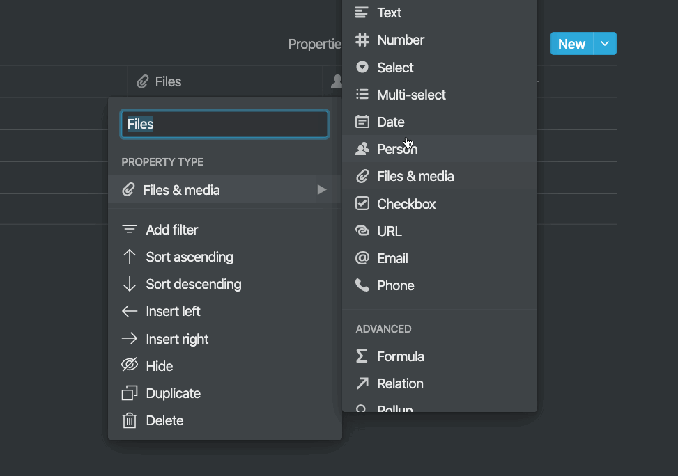
As you can see, when I try to quickly move diagonally from the PROPERTY TYPE into the submenu of property types, Notion doesn’t keep up.
Funny how such a little detail can make such a big difference! 😀
No criticism of Notion here—just goes to show it’s damn near impossible to account for every last user interaction. Despite this and a few other tiny flaws, like the infamous database gap that breaks every designer’s soul…

…Notion still boasts one of the top 5 best user experiences of all SaaS products on the market right now, thanks to its famous approach to design.
Zoom, please learn from Notion’s UX design
It would be superb if Zoom could take a page out of Notion’s product design playbook and update their damned scheduled meeting creator UI:

This is such an old-school way to pick dates & times. A tiny calendar that’s hard to read, a scrollable list of times in 30-minute increments. It pulls me out of flow every single time. Products like Calendly and Google Calendar have figured it out. I’m sure Zoom, a top video conferencing tool, can too.
To riff on Zoom for one more minute, have you noticed that it’s impossible to remove the password requirement on free accounts?
This is because it’s set at the “admin” level—and, for some mysterious reason, Zoom doesn’t consider a free user to be an admin of their own account.

Let’s end on a positive note. How about a throwback to the tweet that went viral and drove over a thousand new followers for @detailsRising ?


Superhuman is truly a case study in the pursuit of user experience perfection. In fact, Rahul Vohra explained to Harry Stebbings just why the app feels so damn nice. It keeps you in flow. Highly recommend you check out the 20VC episode for yourself.
Until next time! ✌️